Tamian Wood, founder of Beyond Design International, specializes in cover design in a diverse array of genres. With over 20 years experience, she works with self published authors as well as several traditional publishers, to make their work shine! You can see a quick 2 minute video portfolio here or visit her web site at BeyondDesignInternational.com.
You glance across a crowded room and lock eyes. You are inspired, beguiled. Suddenly, “love-at-first-sight,” makes sense and you feel the spark of a love affair blossoming with ...
the BOOK of your dreams?...
Ok, that might be taking the metaphor a bit too far, but work with me on this. The ultimate goal of your books' cover is to grab your readers' attention and tell them in an instant, “Take me HOME, I’m just what you need! Pay no attention to all those other books, I’m the one!”
Think of it like your favourite little black dress that shows off your curves, and accentuates your... assets. :-)
Let's face it, there are really only two reasons to write a book:
- To say you did, and
- To sell it.
Unless you only wrote your book so your grandmother could read it, and your target audience is your crazy cousin Emma, Auntie Eileen and Uncle George, the cover does matter. Let me say that again, in case you missed it in all the humor -- If you want to sell your book, your cover DOES matter, a LOT.
So, let’s assume you wrote your book to actually sell a few copies. The key then is that you must:
Treat your writing as a business, your book as a product and the cover as its packaging.
The cover is your most important marketing tool, and as such, must be properly packaged to be visually appealing to your target market.
A successfully designed book cover, like that little black dress, will convey the tone of your book, give hints about its content, and entice readers into actually picking up your product to read your meticulously written and diligently edited words. Metaphorically, you’ve just been asked out for a first date. Only then can your inner beauty be discovered.
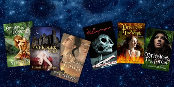
Let's have a look at some examples and see what they tell you about what’s under the covers... (Ok, I’ll stop.)
Ponder on this cover package for a moment.
What does the colour story tell you about what’s inside? It’s fresh, clean, green grass, blue sky. How does it make you feel? Cheerful, hopeful?
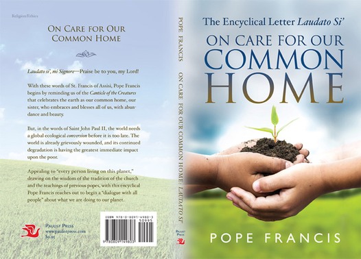
What’s under the cover, you ask? A letter from Pope Francis about caring for our common home, Earth.
The cover I created for the Pope’s Encyclical Letter is designed to make you think about our environment, ecology, and our children's future. The fresh greens, calming blues and flesh tones are used intentionally to evoke a feeling of newness, and concepts of youth, growth, and springtime rebirth.
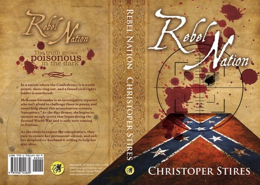
What about these next two. How do they make you feel?
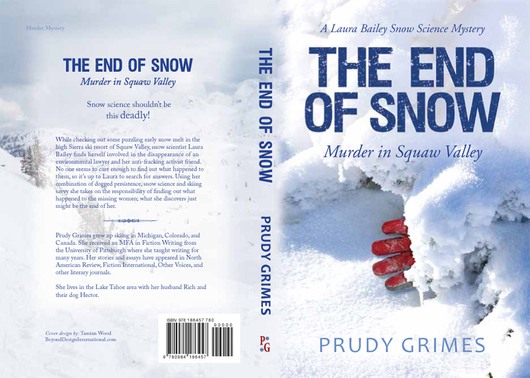
The colour red in both of these images tells us they might be about death, but the fonts also tell us a story too. Notice that the bold modern font on The End Of Snow tells us that the story is based in modern day. If you zoom in close, you’ll also notice the texture of the font feels like a blizzard.
With Rebel Nation, we can surmise from the font that it has something to do with history. The rebel flag also gives a historical clue... but why is there a modern day rifle site? Hmmm, intriguing.
In the case of these next two the softer font tells us this is a more feminine story. But what else can we discover about these two. Do they belong together? What clues tell you this?
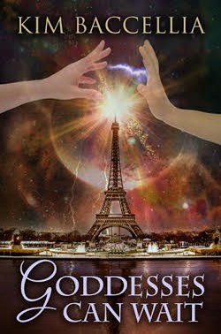
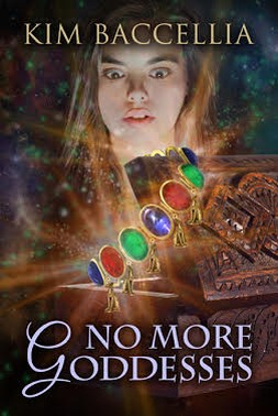
With a sequel, it’s important to have consistency in the overall look and feel from one book to the next so your readers (or searchers) will know these stories belong together. This is known as “branding.” Typically, the colour story will likely match and text treatment is usually similar.


Notice the repeating elements. The spherical object at the top of the design space, the light source just below, the city-scape in the foreground, and the similar text treatment. All these elements let us know that these are part of a sequel.
Another important thing to note is that there should be a strong contrast between the text and the image behind so that your words are legible.


And, you should always keep in mind that the cover will be displayed on digital browsers at a thumbnail size, so it is important the elements are minimal. Including every detail from your story only serves to make your cover busy and confusing, and gives away too much, too soon. Remember our little black dress and keep it simple and classic.
One final little tid bit of advice I always give new authors is, if you are beginning to write a book, start saving from day one so that when it’s complete, you’ll have a tidy little nest egg to invest in what it takes to make your product look professional.
Because it matters. A lot.
Tip of the Day:
If you're a writer in need of an experienced cover designer, but you would like to minimize the costs, please take a look at Writers Boon discounted marketplace. You will find amazing designers who worked with authors from the Big 5 Publishing houses willing to offer 15% to 30% discount on their regular fees.